Series: value
Model: ARIMA(0,1,1)

Coefficients:
          ma1
      -0.4196
s.e.   0.1224

sigma^2 estimated as 11674:  log likelihood=-280.26
AIC=564.52 AICc=564.8 BIC=568.1816 Advanced Forecasting Models: ARIMA
While ETS models excel at capturing trends and seasonal patterns through exponential smoothing, ARIMA models take a fundamentally different approach. ARIMA (AutoRegressive Integrated Moving Average) models leverage the autocorrelation structure of your data – the relationship between observations at different time lags. Think of it as a model that learns how today’s value relates to yesterday’s, last week’s and last month’s values, then uses those relations to predict tomorrow.
The beauty of ARIMA in the fable framework is that it automates what was traditionally a complex, manual process of model identification, estimation, and diagnostic checking. What once required advanced statistical expertise now becomes accessible through intuitive functions that maintain the tidy workflow.
16.1 Understanding the ARIMA Framework
ARIMA models have three key components represented by the notation ARIMA(p,d,q):
- AR(p) - AutoRegressive: The autoregressive component is the p-th order dependence of the current observation on previous observations. It is simply how much each value depends on its immediate predecessors. This component models the memory in the series.
- I(d) - Integrated: This represents the number of times (d) the raw observation have been differenced to make the time series stationary. A stationary series as explained in Chapter 12, is one whose statistical properties do not change.
- MA(q) - Moving Average: The moving average component is the q-th order dependence of the current observation on previous forecast errors (or residuals).
For practical application, the fable package can automatically select the best ARIMA configuration by minimising information criteria like AICc. We apply this to the cereal yield training data (training_yield)
The ARIMA() function is used to fit an ARIMA model in the fable framework, ARIMA(value) allows the algorithm to automatically select the best ARIMA model components. The function tests multiple combinations of p, d, q parameters. It uses a stepwise algorithm to efficiently search the model space.
The output from the report() function shows the selected ARIMA order and estimated parameters. The automatic selection process chose the configuration ARIMA(0,1,1) for the cereal yield training data. This chosen configuration tells us exactly how the model accounts for the data’s past and trend.
- \(p=0\) (AutoRegressive): The model determined that, after applying a first order differencing, there is no significant correlation between the current value and the previous lagged values of the differenced series.
- \(d=1\) (Integrated): The model required a first-order differencing (d=1) to achieve stationarity. This confirms the cereal yield series has a linear trend that must be removed before modelling the residual fluctuations.
- \(q=1\) (Moving Average): The model includes a first-order Moving Average term [MA(1)]. This means the current prediction depends on the forecast error from the immediate previous period.
The above model can be formally written as
\[\hat{y}_t=y_{t-1}+\theta_1e_{t-1}+e_t\]
Where \(y_t\) is the current observation, \(\hat{y}_t\) is the forecast, \(e_t\) is the current error, \(e_{t-1}\) is the previous error and \(\theta_1\) is the \(MA(1)\) coefficient.
The estimated coefficients, residual variance and information criteria are also provided in the report() output. the \(ma1\) coefficient (-0.4196) is the estimated value of \(\theta_1\) parameter. The negative sign suggests that the model uses the previous forecast error to adjust the current forecast in the opposite direction. The standard error (\(s.e.\)) of 0.1224 indicates the precision of this estimate.
16.2 ARIMA Model Components Demystified
16.2.1 AutoRegressive (AR) Component (p)
The AR part of an ARIMA model, as described earlier, captures the relationship between a current observation and a linear combination of its immediate predecessors. The current value, \(y_t\), is expressed as a weighted sum of \(p\) past values plus a random error term (\(\varepsilon_t\)):
Equation: \(y_t=\varphi_1y_{t-1}+\varphi_2y_{t-2}+\cdots+\varphi_py_{t-p}+\varepsilon_t\)
The coefficients \(\varphi_1,\varphi_2\cdots,\varphi_p\) quantify the strength and direction of the relationship with the lagged values.
An AR(1) model would simplify this to only the most recent predecessor:
\(\text{Today's value}=\text{constant}+\varphi_1\times\text{yesterday's value}+\text{random error}\)
If \(\varphi_1\) is positive and high (e.g., 0.8), a high value yesterday strongly suggests a high value today.
16.2.2 Integrated (I) Component (d)
The Integrated (I) component handles the process of differencing the data to make the series stationary. Stationarity is a requirement for AR and MA process to be statistically valid. The order \(d\) specifies the number of times differencing must be applied:
First Differencing \((d=1)\): This removes a linear trend. It calculates the change from one period to the next:
\[
\nabla y_t=y_t-y_{t-1}
\]
Second Differencing \((d=2)\): This removes an accelerating or non-linear trend. It calculates the change in the change (i.e. the acceleration) over time
\[ \nabla^2 y_t=\nabla y_t-\nabla y_{t-1} \]
We have already seen how differencing our data is done in Chapter 12.
16.2.3 Moving Average (MA) Component (q)
The Moving Average (MA) part models the relationship between the current observation and previous forecast errors (or residuals). This component models the short-term shock or correction mechanisms in the series.
The current value, \(y_t\), is expressed as a weighted sum of \(q\) past error terms (\(varepsilon_{t-1},\cdots,\varepsilon_{t-q}\)) plus the current error (\(\varepsilon_t\))
Equation: \(y_t=\varepsilon_t+\theta_1\varepsilon_{t-1}+\theta_2\varepsilon_{t-2}+\cdots+\theta_q\varepsilon_{t-q}\)
The coefficients \(\theta_1,\theta_2,\cdots,\theta_q\) quantify the magnitude of influence from the previous errors.
An MA(1) model would consider only the error from the most recent period: \(\text{Today's value}=\text{constant}+\theta\times\text{yesterday's forecast error}+\text{random error}\)
Think of it like learning from mistakes - if you over-predicted yesterday, the model uses the coefficient \(\theta_1\) to adjust today’s forecast, correcting the bias.
16.3 The ARIMA Modelling Workflow in fable
The ARIMA modelling process is systematic, beginning with diagnosis and preparation of the data before fitting the final model. The standard workflow involves six steps. Step 1: Visualize → Step 2: Check Stationarity → Step 3: Identify Model → Step 4: Fit → Step 5: Diagnose → Step 6: Forecast.
16.3.1 Visualise Time Series
We begin by first visualising our time series data, the training set of the cereal yield data (training_yield). More information on visualising time series tsibbles can be found in Chapter 9
training_yield |>
  autoplot(value)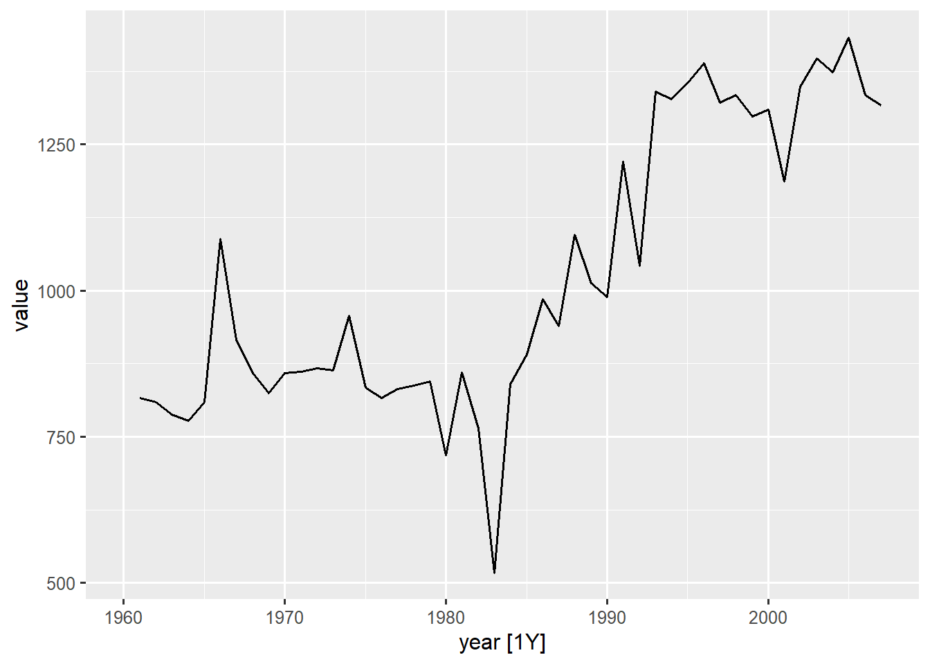
16.3.2 Check Stationarity
A fundamental requirement for fitting an ARIMA model is that the series must be stationary, meaning its statistical properties like mean and variance remain constant over time. Chapter 12 talks more about this topic. The cereal yield series, due to its obvious trend is likely non stationary.
The autocorrelation function (ACF) plot is the first diagnostic tool for checking a series’ stationarity.
# check stationarity visually with ACF plot
training_yield |>
  ACF(value, lag_max = 18) |>
  autoplot()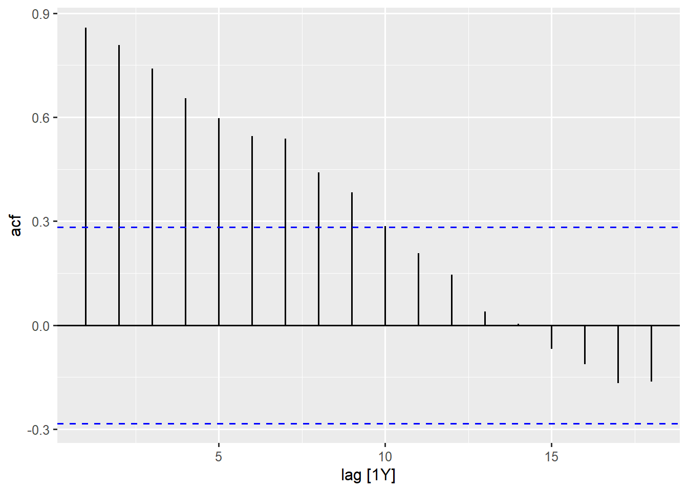
For the cereal yield data, the bars of the ACF plot shows a gradual change or decay (slowly falling). This is a strong indicator of non-stationarity and confirms the existence of a trend in the time series data. This means the data needs differencing.
To statistically confirm non-stationarity, the KPSS unit root test (unitroot_kpss) is used.
# statistical test for stationarity
training_yield |>
  features(value, features = unitroot_kpss)
# A tibble: 1 × 3
indicator_name kpss_stat kpss_pvalue
<chr> <dbl> <dbl>
1 Cereal yield _kg per hectare 1.00 0.01The output from the test confirms our conclusion from the ACF plot. The small p-value (0.01) suggests that we must reject the null hypothesis of stationarity. This statistically confirms the visual inspection; that the data is non-stationary and requires differencing (the I(d) component).
We can go ahead now to check how the differenced series and original series compare visually.
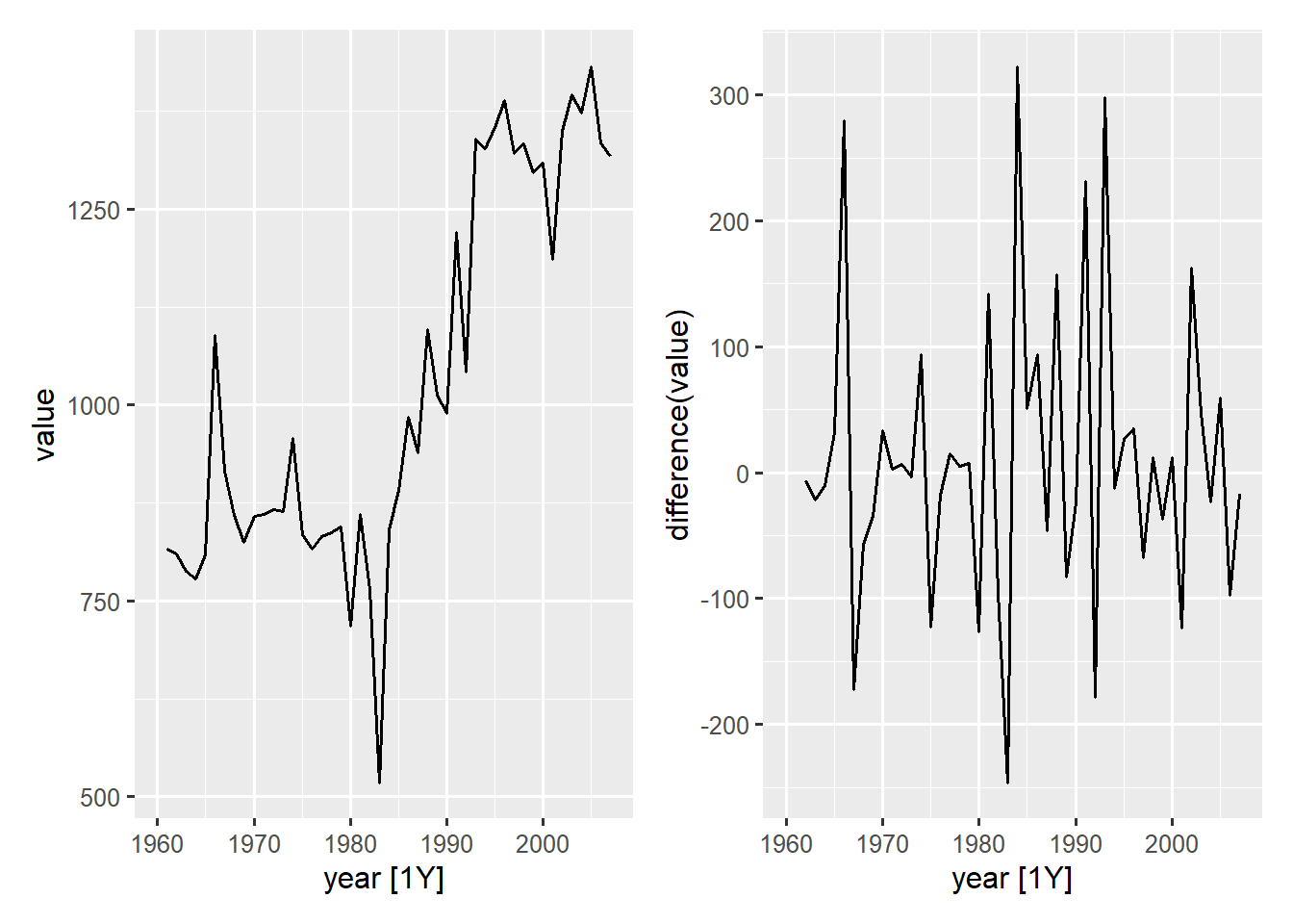
The differenced series plot (right) shows a stable series fluctuating around zero with no trend.
16.3.3 Identifying Model Order (p, d, q)
While automatic fitting is possible, understanding how to manually determine the ARIMA order using ACF and PACF plots is crucial for advanced diagnostics.
The fable package provides room to manually specify the order in the ARIMA() function. Before we manually determine and fit the ARIMA model, It is important to note that fable can also perform a thorough search of the model space for the automatic model selection by specifying stepwise = FALSE in the ARIMA() function.
# A tibble: 1 × 4
  .model          AICc ar_roots  ma_roots
  <chr>          <dbl> <list>    <list>
1 stepwise_false  565. <cpl [0]> <cpl [1]>
stepwise = FALSE performs a more exhaustive search (slower but more thorough). The best model is chosen based on the lowest AICc. The glance() provides a summary of the model’s structure and fit statistics.
We intend to manually specify the order of ARIMA to be used for the fitting. By observing the PACF and ACF plot, we can be guided on what the order for the ARIMA would be.
# look at ACF and PACF plots
training_yield |>
  gg_tsdisplay(value, plot_type = "partial")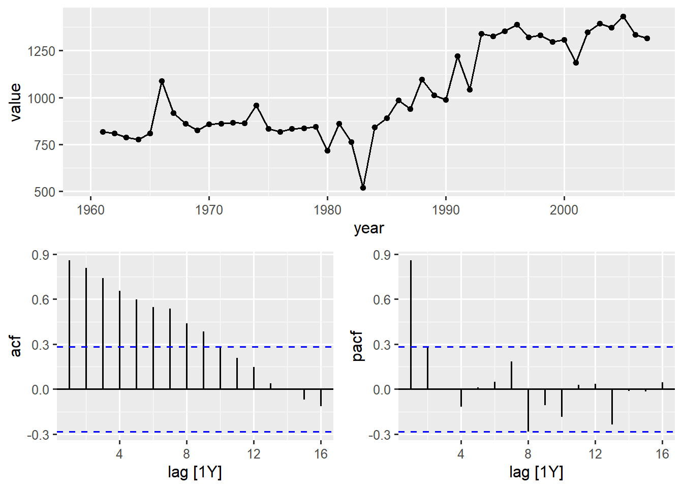
The ACF plot (bottom left) shows a gradual decay, confirming the series is non-stationary (requires differencing). The PACF shows a single large spike at lag 1, which then cuts off (falls immediately inside the confidence bounds). This behaviour strongly suggests a starting point of an AR(1).
Since the series is non-stationary we will perform a first order differencing on it (\(d=1\)) and then re-examine the PACF and ACF plots to identify p and q.
# look again at PACF and ACF plots after differencing
training_yield |>
  gg_tsdisplay(difference(value), plot_type = "partial")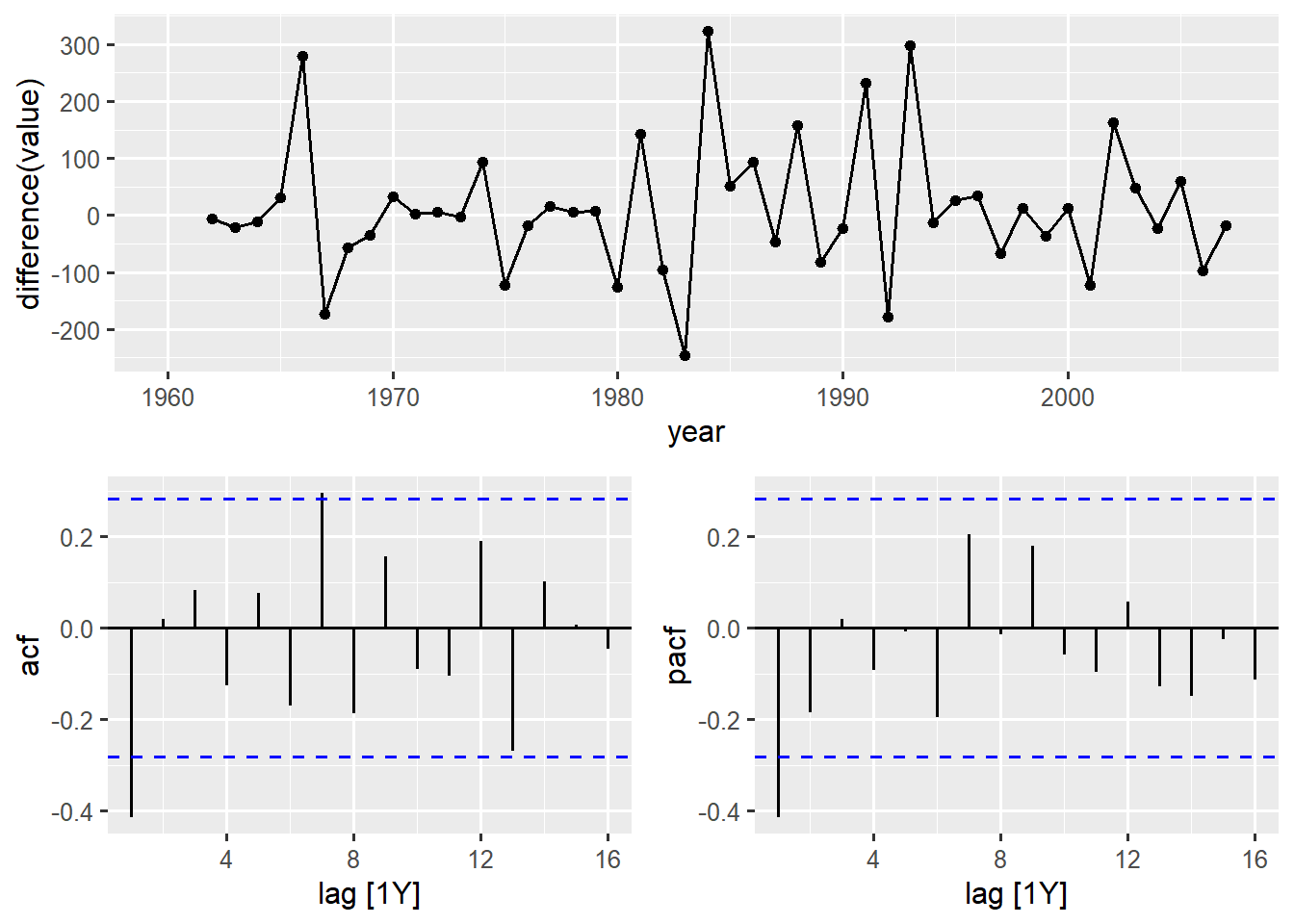
The differenced series now shows stationarity (top plot), fluctuating around a constant mean (zero). The PACF and ACF plots both show a spike at lag 1 and then cuts off (fall within the significance bands). The behaviour of the two plots suggests a mixed ARIMA model with both AR and MA terms, specifically an ARIMA(1,1,1) or a related structure, as the behaviour suggests both an AR(1) and MA(1) model may be needed.
The ACF and PACF plots are the primary tools used to manually identify the appropriate orders for the AR(p) and MA(q) components of an ARIMA. The general guiding rule relies on observing how the correlations “cut off” (drop sharply to zero) in each plot after the series has been differenced to achieve stationarity.
| Plot Behaviour | Indicates | ARIMA Components Implied |
|---|---|---|
| ACF decays gradually | Non-stationarity | Needs differencing \((d\ge1)\) |
| ACF cuts off suddenly after lag q | Moving Average (MA) | Set \(q\) to the lag where the cut-off occurs |
| PACF cuts off suddenly after lag p | AutoRegressive (AR) | Set \(p\) to the lag where the cut-off occurs |
| Both ACF and PACF decay gradually | Mixed Model | Set both \(p\ge1\) and \(q\ge1\) (e.g., ARIMA(1,\(d\),1)). |
The final model chosen by the automatic function, ARIMA(0,1,1), is often the result of the automatic routine simplifying this complex ARIMA(1,1,1) pattern into a more parsimonious MA model.
16.3.4 Fitting the Model: Manual ARIMA Specification
Once the components are determined through the ACF and PACF plots, we can now fit the model by manually specifying the order inside pdq() within the ARIMA()function.
# specify ARIMA model manually
manual_arima <- training_yield |>
  drop_na() |>
  model(
    arima_111 = ARIMA(value ~ pdq(1,1,1))
  )

report(manual_arima)
Series: value
Model: ARIMA(1,1,1)
Coefficients:
ar1 ma1
-0.1579 -0.2938
s.e. 0.3075 0.2939
sigma^2 estimated as 11871: log likelihood=-280.14
AIC=566.27 AICc=566.84 BIC=571.7616.3.5 Model Diagnostic and Residual Analysis
After an ARIMA model is fitted, the final and most crucial step before forecasting is a diagnostic check of the residuals (the forecast errors). A well-specified ARIMA model should capture all the underlying structure (AR, I, MA) in the data, leaving only white noise as the residual error. White noise has three key properties: the errors are uncorrelated, have zero mean and a constant variance.
Visual Residual Check
The gg_tsresiduals() function is able to generate a three-part diagnostic plot for the residuals (labelled as .innov or “innovation residual” in the plot).
# visual residual check
manual_arima |>
  gg_tsresiduals()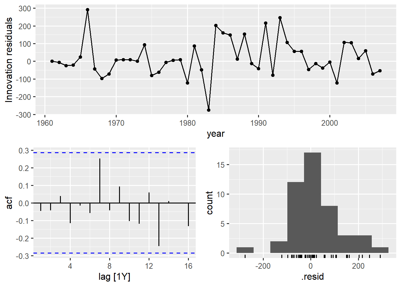
The resulting plot from the gg_tsresiduals() function provides the following checks
- A plot of the residuals over time (top). A good model will show the residuals fluctuating randomly around zero, with no noticeable patterns or trends. The plot confirms the residuals are centred near zero and appear randomly scattered between -300 and 300
- An ACF plot (bottom left) that checks for autocorrelation in the residuals. If the residuals are white noise, all correlation bars should fall within the blue dashed confidence bounds (or be very close to zero). The plot shows no significant spikes remaining, suggesting the ARIMA model successfully captured the dependence structure (AR and MA)
- A histogram (bottom left) that shows the distribution of the residuals. Ideally, residuals should be normally distributed (bell-shaped) with a mean near zero. The histogram shows a distribution that is roughly centred near zero but may not be perfectly symmetrical.
Statistical Residual Check
The Ljung-Box test is a formal statistical method to confirm that the residuals, as a group, are not distinguishable from white noise.
# statistical residual check
augment(manual_arima) |>
  features(.innov, features = ljung_box, lag = 16)
# A tibble: 1 × 4
indicator_name .model lb_stat lb_pvalue
<chr> <chr> <dbl> <dbl>
1 Cereal yield _kg per hectare arima_111 12.7 0.695The innovation residuals (.innov) are extracted from the model with augment() and the Ljung-Box test (ljung_box) is applied to them via the features() function. lag=16 tells the Ljung-Box test to check for serial correlation across the first 16 lags.
The null hypothesis (\(H_0\)) for this test is that the residuals are independently distributed (i.e., they are white noise). Since the p-value (0.69) is greater than 0.05, we fail to reject the null hypothesis. The test confirms that the residuals are statistically good, meaning the ARIMA model is well-specified.
Normality Check (Q-Q Plot)
We can further confirm if the residuals follow a normal distribution with a Q-Q plot. The Quantile-Quantile (Q-Q) plot is used to visually assess the assumption that the residuals follow a normal distribution.
augment(manual_arima) |>
  ggplot(aes(sample = .innov)) +
  stat_qq() +
  stat_qq_line()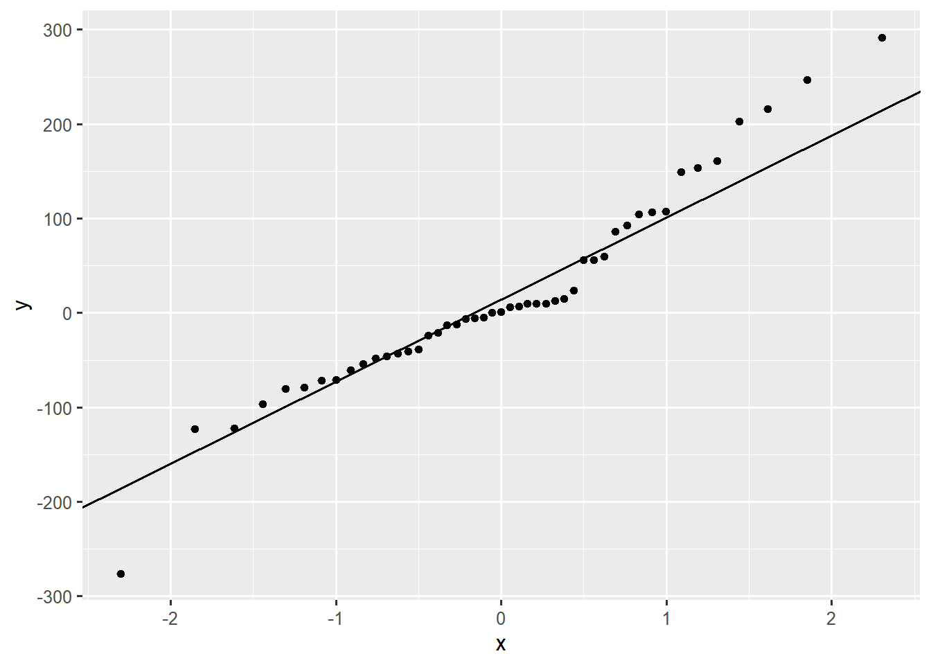
ggplot(aes(sample = .innov)) sets up the plot to compare the residuals (.innov) against the theoretical quantiles of a normal distribution. stat_qq() plots the residual quantiles as points and stat_qq_line() draws a straight line that represents a perfect normal distribution.
The plot shows that for a large portion of the residuals (the points near the middle), they closely follow the straight line. However, the points in the tails deviates noticeable from the line, especially on the upper right. This suggests the residuals may have heavier tails than a pure normal distribution, but for many forecasting purposes, this minor deviation may be tolerated if the Ljung-Box test passes.
16.3.6 Generating ARIMA Forecasts
Once the ARIMA model has passed the diagnostic checks - confirming its residuals are white noise - it can be used to generate reliable forecasts. We can use the fitted ARIMA(1,1,1) model (manual_arima) on the cereal yield training set to project future values.
# generate forecasts
arima_forecast <- manual_arima |>
  forecast(h = 8)

# examine forecast details
forecast_details <- arima_forecast |>
  hilo() |> as_tibble()

forecast_details |>
  select(year, .mean, `95%`)
# A tibble: 8 × 3
year .mean `95%`
<dbl> <dbl> <hilo>
1 2008 1336. [1122.015, 1549.114]95
2 2009 1333. [1089.092, 1576.174]95
3 2010 1333. [1055.932, 1610.260]95
4 2011 1333. [1026.923, 1639.122]95
5 2012 1333. [1000.359, 1665.710]95
# ℹ 3 more rowsThe forecast() function is used to project the series forward by \(h=8\) (8 years). The resulting forecasts show the projected mean value and a 95% confidence intervals. The model suggests the current yield value depends on \(d=1\) (Integrated; the previous year’s yield (to model the trend), \(p=1\) (AR); the previous year’s differenced value and \(q=1\) (MA); the previous year’s forecast error.
The point forecasts (.mean) quickly stabilise to a constant value of 1333. The AR and MA components only influence the forecast horizon for a short period (typically 1-2 steps ahead), after which the forecast relies solely on the Integrated component. Since \(d=1\), the long term forecast for undifferenced series becomes a flat line (i.e, the rate of change is projected to settle at zero). The 95% confidence interval demonstrates increasing uncertainty, widening significantly from ~427 units in 2008 to ~804 units by 2015 (almost twice).
16.3.7 Visualising ARIMA Forecasts
Visualising the forecast provides a useful assessment of the model’s historical fit and its long-term projections
# create comprehensive forecast visualisation
arima_forecast |>
  autoplot(training_yield, level = 95) +
  autolayer(manual_arima |> augment(), .fitted, colour = "red") +
  labs(title = "ARIMA(1,1,1) Model Forecast")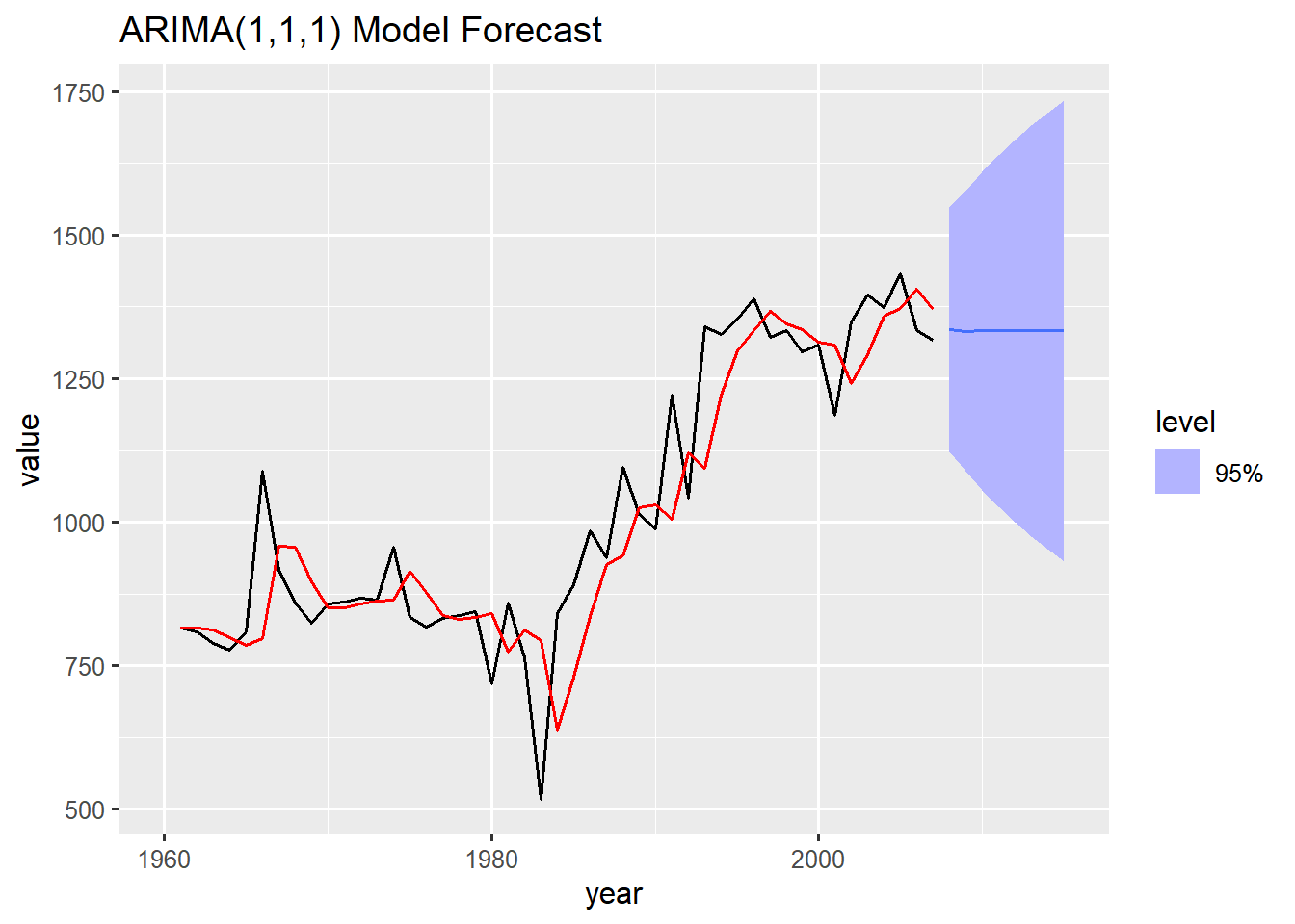
The historical fit (red) from the resulting visuals tracks the general upward movement and fluctuations of the training data (black), demonstrating that the ARIMA(1,1,1) model successfully captured the overall trend and short-term correlations.
The forecast line (blue) stabilises and flattens out to a horizontal trajectory. This flattening is characteristic of ARIMA models with \(d=1\) (first differencing) when projecting far into the future, as the underlying MA and AR influence eventually dies out. The blue shaded region visually confirms the increasing uncertainty, tapering outward as the forecast moves into later years.
16.4 Seasonal ARIMA Models
For data with seasonal patterns, the standard ARIMA model must be extended to account for correlation in the seasonal lags. This is achieved through the Seasonal ARIMA (SARIMA) model.
16.4.1 Understanding the \(SARIMA\) Notation
A seasonal ARIMA model includes both non-seasonal and seasonal components, represented by the notation \(\text{ARIMA(p,d,q)(P,D,Q)[m]}\).
\((p,d,q)\) is the non-seasonal order that captures short term dependencies and trend removal as in standard ARIMA
\((P,D,Q)\) is the seasonal order that captures the dependence on values and errors that occurred \(m\) periods ago (i.e., in the same season last year).
\([m]\) is the number of periods per season (e.g, \(m=4\) for quarterly data, \(m=12\) for monthly data)
16.4.2 Demonstrating the \(SARIMA\) Workflow
We use the Australian quarterly cement production series to demonstrate the complete SARIMA workflow.
Visualise
We start with a visual identification of seasonal patterns. Quarterly data means the seasonal period \(m = 4\).
# SARIMA workflow with the cement production data
# visualise seasons
library(patchwork)
p1 <- training_cement |>
  gg_season(Cement, period = "2y", show.legend = FALSE) +
  labs(title = "Bi-Annual Seasonal Pattern") + scale_x_yearquarter(breaks = "6 months")

# sub-series plot
p2 <- training_cement |>
  gg_subseries(Cement) +
  labs(title = "Seasonal Subseries")

# STL decomposed plots
p3 <- training_cement |>
  model(STL(Cement)) |>
  components() |> autoplot() +
  labs(subtitle = NULL)

p1 + p2 + p3 +
  plot_layout(
    design = "
    AAABBB
    #CCCC#
    "
)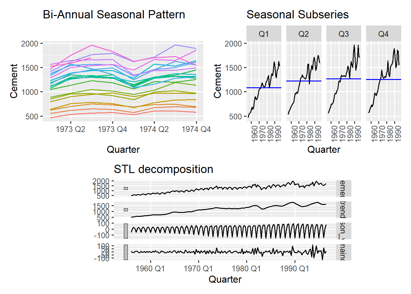
We produce three key plots to visualise and decompose the seasonality. The seasonal plot (top left) shows the data broken down by seasonal cycles, which helps to identify the nature of the seasonality. The lines representing different years run parallel to each other, but the level of the entire series is clearly increasing over time. The lines are grouped by a two-year period.
The seasonal sub-series plot (top right) displays the time series for each individual quarter over the entire time period. Each panel shows the trend within that specific quarter. Every quarter shows a strong upward trend over the years. The blue horizontal line in each panel represents the average production for that quarter. The plot confirms that quarter 3 (Q3) and quarter 4 (Q4) consistently have the highest production levels.
The third plot at the bottom is an STL decomposed visualisation of the time series, breaking it into its core components - a trend, a seasonal and remainder component. The overall visualisation confirm the quarterly cement series requires a model that handles both non-seasonal trend removal (\(\text{likely }d=1\)) and seasonal differences (\(D=1\)) to remove the strong seasonal pattern.
Check Stationarity
Before fitting the SARIMA model we must address the non-stationarity identified from the visual inspection (strong upward trend and fixed seasonal pattern)
# check stationarity
training_cement |>
  features(Cement, features = unitroot_kpss)
# A tibble: 1 × 2
kpss_stat kpss_pvalue
<dbl> <dbl>
1 3.09 0.01We use the KPSS unit root test to statistically confirm the presence of a deterministic trend, which causes stationarity. The p-values (0.01) is less than 0.05, leading us to reject the null hypothesis of stationarity. This is a clear indication that the series is non-stationary, requiring differencing.
# apply seasonal and first differencing
training_cement |>
  gg_tsdisplay(
    difference(Cement) |> difference(lag=4),
    plot_type = "partial"
    )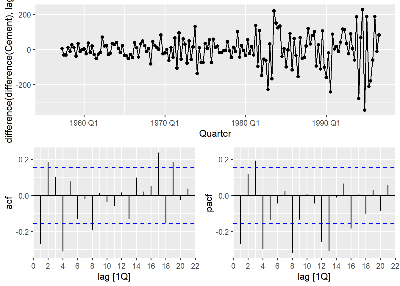
The initial visualisation showed two types of non-stationarity; a strong upward trend and a fixed seasonal pattern. To remove both we apply two types of differencing;
- a first order differencing \((d=1)\)
difference(Cement)to remove the linear trend. This calculates the difference between consecutive periods. - seasonal differencing \((D=1)\)
... differencing(lag = 4)to remove the seasonality (\(m=4\) for quarterly data). This calculates the difference between the current and the same quarter last year.
We use gg_tsdisplay() function to plot the double-differenced series. This is essential for identifying the final \(\text{p,q,P,Q}\) orders. After differencing, the time series plot now fluctuates around zero with no clear trend or seasonal cycle, confirming stationarity. The ACF and PACF plots show the remaining correlations structure in the stationary series. There are 2 key concepts to look out for in determining the \((p,q,P,Q)\) orders:
- Early lags (1,2,3…): These are the non seasonal lags and are used to determine the orders p and q
- Seasonal lags (e.g 4,8,16..for quarters, 12,24,36…for months): This is the seasonal component and they help to determine the P and Q orders.
To determine the seasonal order, we check the ACF and PACF plot at the seasonal lags (4,8,12,16…). There is a significant spike at lag 4 and 8 with subsequent seasonal lags falling within the significant bounds in the ACF plot. The lag cuts off after the 2nd seasonal lag suggesting seasonal MA(2) \(Q=2\). The PACF decays for regular lags after the first lag but still prominent for seasonal lags till after seasonal lag 12. This still proves a seasonal MA model where the ACF cuts off and the PACF decays, pointing to a seasonal ARIMA(0,1,2).
With the non seasonal order, we look at the first few lags of the ACF and PACF plots. There is a significant spike at lag 1 and 2 (excluding seasonal spikes) of the ACF plot while the rest remain within bounds. This suggests an MA(2) \(q=2\). The PACF also shows a significant spike at lag 1 and lag 3 (excluding seasonal spikes). This suggests an AR(3), \(p=3\). The presence of significant spikes at lag 2 and lag 3 in both plots followed by cut-offs , suggest a simultaneous need for both AR and MA components. This leads to a non-seasonal ARIMA(3,1,2) structure.
Combining both the non-seasonal and seasonal components, the ACF and PACF plots suggests \(\text{ARIMA}(3,1,2)(0,1,2)[4]\).
Honestly, ACF/PACF interpretation is more of an art than science, especially for seasonal data. Always start small and focus on obvious patterns. Also remember that when the ACF and PACF patterns are not clear you can always use the automatic ARIMA() function and let the algorithm decide.
Fitting the Model
After identifying the order, we can now fit the model and prepare for forecasting. Here we will fit three models; an automatic model, another automatic model with a more thorough search and our identified model order from the ACF and PACF analysis.
# fit seasonal arima models
sarima_models <- training_cement |>
  model(
    auto_sarima = ARIMA(Cement),
    thorough_sarima = ARIMA(Cement, stepwise = FALSE),
    sarima = ARIMA(Cement ~ 0 + pdq(3,1,2) + PDQ(0,1,2))
  )

# compare models
glance(sarima_models) |> arrange(AICc)
# A tibble: 3 × 8
.model sigma2 log_lik AIC AICc BIC ar_roots ma_roots
<chr> <dbl> <dbl> <dbl> <dbl> <dbl> <list> <list>
1 auto_sarima 3897. -882. 1778. 1779. 1800. <cpl [2]> <cpl [6]>
2 thorough_sarima 3897. -882. 1778. 1779. 1800. <cpl [2]> <cpl [6]>
3 sarima 4296. -886. 1787. 1788. 1812. <cpl [3]> <cpl [10]>We fit multiple candidate models, our manual specification and two automatic models, and evaluate their performance using statistical measures like AICc. In fable, you add the seasonal specification via PDQ(). For higher order models (where \(p\ge3\) or \(q\ge3\)) you have to combine the manual order specifications with a constant control using 0 or 1 in the formula. This is because fable uses a constant form parameterisation and the constant term \(c\) relates to the mean \(\mu\) via \(c=\mu(1-\varphi_1-\cdots-\varphi_p)\). By default fable will automatically include a constant term if it improves AICc (This only happens when you allow fable to automatically select the orders or when p and q orders are less than 3).
Important
The explicit constant requirement for higher order ARIMA models prevent accidental model misspecification, makes your modelling choices transparent, and ensures you consciously decide whether your data needs a constant term.
The glance() function provides statistical fit metrics for each model. Lower \(AIcc\) indicates a better model, balancing goodness of fit with model complexity. Both automatic methods selected the same best model(\(ARIMA(2,0,2)(0,1,1)[4]\)) with drift. They share the lowest AICc value suggesting the simpler stepwise search was effective and the more exhaustive search did not yield any better structure.
The manually specified model had a significantly higher AICc and a higher residual variance. This shows that the structure derived form the ACF and PACF plots was either overly complex or missed a key correlation structure, resulting in a worse fit compared to the automatic selection.
We can further check the significance of the estimated values using the coef() or tidy() function which presents all the models in a tabular structure with their corresponding coefficient estimates, standard errors and p-values.
coef(sarima_models)The best model (auto_sarima) has all seasonal and non-seasonal estimates being statistically significant. The drift term (constant) which represents the average non zero change or the long run average slope in the series after differencing also shows a high statistical significance, implying a persistent slope in the differenced series.
These outputs validate that the model is a comprehensive representation of the cement production series, successfully accounting for the level, trend, seasonality and the residual autocorrelations
Residual Check & Forecasting
The final stage of the SARIMA workflow involves confirming the model’s validity through residual analysis and then generating forecasts as we did for the non seasonal ARIMA.
A well specified SARIMA model should leave behind residuals that are indistinguishable from white noise. We use both visual and statistical tests to confirm this for the optimal \(ARIMA(2,0,2)(0,1,1)[4]\) model.
# check residuals visually
gg_tsresiduals(sarima_models |> select(auto_sarima))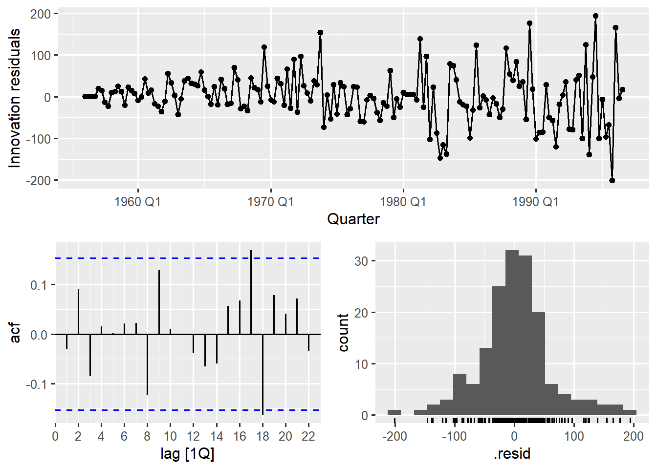
We see the innovation residuals (.innov) (top plot) fluctuating randomly around zero with no obvious patterns or trends, suggesting the model has captured all systematic structure. Almost all spikes at both seasonal and non seasonal lags in the ACF plot are within the blue dashed confidence bounds with lag 17 and 18 slightly overlapping the confidence bound (negligible). This confirms no significant correlation remains in the residuals. The Histogram is also roughly bell-shaped and centred near zero, consistent with the normality assumption.
We further confirm these visual checks with a formal statistical check using the Ljung-Box test.
# check residuals statistically
augment(sarima_models) |>
  features(.innov, features = ljung_box)
# A tibble: 3 × 3
.model lb_stat lb_pvalue
<chr> <dbl> <dbl>
1 auto_sarima 0.147 0.702
2 sarima 0.0734 0.786
3 thorough_sarima 0.147 0.702The large p-values for all three models suggest all models pass the residual check. Since auto_sarima had the lowest AICc (a measure of predictive power), it is selected for forecasting.
# generate a 2year (8quarters) forecast for all models
sarima_forecast <- sarima_models |>
  forecast(h = 8)
The chosen \(ARIMA(2,0,2)(0,1,1)[4]\) model is used to generate an 8-quarter (2-year) forecast. The forecast table generated from the above shows the point forecast (.mean) for all models and their associated variance (\(N(\mu,\varsigma^2)\)) increasing with the horizon.
We create a forecast plot with the auto_sarima model to visually summarise the model’s projection.
# visualise auto_sarima forecasts
sarima_forecast |> filter(.model == "auto_sarima") |>
  autoplot(training_cement)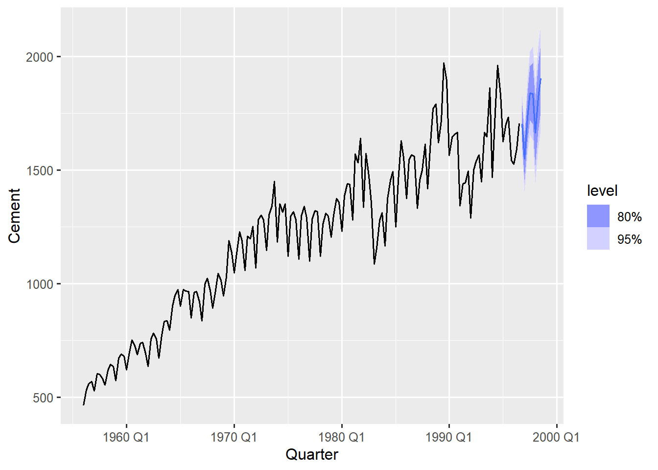
The forecast successfully maintains the seasonal pattern (peaks and troughs matching the seasonal cycle) and the upward trend established by the historic data. This is due to the significant seasonal MA(1) term and the drift term which ensures the trend component continues to project growth rather than flattening out. The blue shaded region widens as the forecast extends further into the future, reflecting the inherent increase in forecast uncertainty over longer horizons.
16.5 Insights from ARIMA Modelling
ARIMA models remain a cornerstone of time series analysis, offering a balance between interpretability and predictive power. Here are some key insights drawn from our modelling process.
The automatic ARIMA selection in the fable package consistently identifies models that strike a balance between complexity and performance, often outperforming manual specified alternatives. This automation ensures that the chosen model is well suited to the data without unnecessary trial and error. In our cereal yield model, the inclusion of MA(1) component demonstrates how the model learns from past forecast errors. By adapting its predictions based on previous inaccuracies, ARIMA improves its ability to forecast future values effectively.
ARIMA models also account for uncertainty through their error structure, producing realistic prediction intervals that widen appropriately as the forecast horizon extends. This feature provides a more honest representation of future variability compared to point forecasts alone. Residual diagnostics also play a crucial role in validating the model. By confirming that residuals resemble white noise, we can be confident that the model has captured all predictable patterns in the data.
For seasonal data, SARIMA models extend this capability by capturing both short-term and seasonal patterns through their dual structure of (p,d,q)(P,D,Q). This ensures that cyclical behaviours are properly modelled alongside regular fluctuations.
Finally, ARIMA models often outperforms alternative methods like ETS when dealing with complex autocorrelation structures, particularly in financial datasets. This comparative advantage makes ARIMA a powerful tool for time series forecasting in domains where relationships between observations are intricate.
16.6 Summary
ARIMA models represent a sophisticated yet accessible approach to time series forecasting that leverages the inherent autocorrelation in your data. The fable implementation makes this powerful technique available to analysts at all levels, automating the complex parts while maintaining transparency and control.
In our next and final chapter, we will bring everything together and rigorously evaluate model performance using the testing framework we established earlier.