# Extract basic calender features
sales_features_basic <- sales_data |>
  mutate(
    # Basic date components
    Year = year(Month),
    Month_only = month(Month, label = TRUE),
    Quarter = quarter(Month),

    # Ghana-specific seasonal features
    Season = case_when(
      Month_only %in% month.abb[4:10] ~ 'Rainy Season',
      Month_only %in% month.abb[c(1,2,12)] ~ "Dry Season",
      TRUE ~ "Transition"
    ),
    # Holiday/Business cycles
    is_holiday_season = Month_only %in% month.abb[c(3,12)],  # Most Holiday months
    is_back_to_school = Month_only %in% month.abb[9:10],  # Typical start of academic year

    # economic calender features
    is_year_start = Month_only == 'Jan',
    is_year_end = Month_only == 'Dec',
    is_mid_year = Month_only == 'Jun'
)8 Creating Useful Time-Based Features
After learning how to handle dates and time with lubridate, it is time to unlock the true power of time series analysis; feature engineering. Think of your date column as a treasure chest filled with valuable information. Feature engineering is the process of opening that chest and extracting the gems hidden within.
In this chapter, you will learn how to transform simple dates into powerful predictors that can dramatically improve your forecasting models. We will work with the sales_data and gh_ts data sets we used in Chapter 6 and Chapter 5 respectively to create features that capture seasonal patterns, economic cycles and long-term trends relevant to the Ghanaian context.
8.1 Basic Time Based Features
For this demonstration, we will use only the sales_data which contains monthly sales from 2015 to 2019.
8.1.1 Calendar-Based Features
These are the most straightforward features derived directly from the date component. Here we use the date itself (The Month column) to categorise and enrich the data. This can be crucial for capturing predictable cyclic patterns that repeat yearly, quarterly, or monthly.
The basic date components captures the level of aggregation. Models use these to find annual trends or quarterly seasonality. The Ghana-specific seasonal features, creates a seasonal flag that may influence sales (like less travels during heavy rain). The holidays/business cycles, and economic calender features creates a logical (TRUE/FALSE) tag identifying major holiday periods, periods when schools reopens and end of period effects such as budget finalisation or semi annual targets that influence sales activities.
This whole process transforms a simple Date column into many powerful categorical and numerical features, which a predictive model can easily interpret. This can significantly improve the models ability to forecast.
8.1.2 Creating Lag Features
Lag features are arguably the most important feature type for time series analysis. A lag feature is the value of the series at a previous time step. They capture temporal dependencies (autocorrelation) – the idea that a value today is highly correlated with its value yesterday, last week or last year.
For this demonstration we will use the gh_ts dataset focusing on some key indicators from the data (Annual GDP growth, Total Population, GDP per-capita in USD and Cereal yield per hectare).
# Create lag and difference
gh_ts_lags <- gh_ts_filtered |>
  group_by(indicator_name) |>
  mutate(
    # Lag features (previous values)
    value_lag1 = lag(value, 1),

    # Difference features (changes over time)
    value_diff = value - value_lag1,
    value_pct_change = (value - value_lag1) / value_lag1 * 100
  )
The lag features are calculated using the lag() function from the dplyr package. The function takes a vector of values (usually a column from a dataframe) and the number of positions to lag. In the code above we shift the values for each indicator by 1 year (value_lag1), calculate the difference between the original values and the lagged values (value_diff), and then further calculate the relative year-over-year change (value_pct_change). The differencing helps to remove the level (baseline value) and trend (long term direction) which is a key step in achieving stationarity when fitting an ARIMA model.
Important
When fitting an ARIMA model (with the fable package) you do not need to manually calculate the lag and differencing. The model handles this automatically.
By engineering these calendar and lag features for fitting a particular model, the model gains profound understanding of the data’s historical movement, leading to significantly more accurate forecasts.
8.2 Feature Selection and Analysis
After creating numerous features, the next step is to determine which ones are genuinely useful predictors and should be included in the final model.
8.2.1 Correlation Analysis
Correlation measures the linear relationship between two variables. To check feature importance using correlation, we are essentially looking at how strongly each feature is linearly related to the target variable. We can demonstrate this with the gh_ts_lags data we just created.
We will add more features to the data and check how they all relate to the target variable (value). The new features will include another lagged value that shifts the value 2 time steps back and a binary feature (TRUE/FALSE) for election years since 1960.
We can now go ahead and check the importance of all these features using their correlation with the original value (value column). The data we have has 4 keys, meaning there are 4 separate time series’ within the data. We are going to focus only on the values for the “Annual GDP growth rate” series.
# correlation analysis of features with GDP growth
gdp_correlations <- gh_contextual |>
  filter(indicator_name == "Annual GDP growth rate") |>
  as_tibble() |>
  select(value, value_lag1,
         value_diff, value_pct_change,
         value_lag2, election_year) |>
  mutate(
    # recode election_year
    election_year = case_match(
      election_year,
      TRUE ~ 1,
      FALSE ~ 0
    )
  ) |>
  cor(use = "complete.obs")
Warning: There was 1 warning in `mutate()`.
ℹ In argument: `election_year = case_match(election_year, TRUE ~ 1, FALSE ~
0)`.
Caused by warning:
! `case_match()` was deprecated in dplyr 1.2.0.
ℹ Please use `recode_values()` instead.The code above calculates the correlation matrix for the selected variables using the cor() function. Since the cor() function only works on numeric vectors, the election_year had to be converted to numeric binary values (0 and 1). The table below shows the correlation of the selected variables with the actual value.The features with high correlation (positive or negative) are strong candidates for inclusion in the final forecasting model.
| value | |
|---|---|
| value_lag1 | 0.372 |
| value_diff | 0.561 |
| value_pct_change | 0.349 |
| value_lag2 | 0.125 |
| election_year | 0.085 |
8.2.2 Visualising Feature Relationships
Creating visuals of your data is the best way to confirm the relationship derived from the correlation analysis and see how the engineered features relate to the underlying data.
gh_contextual |>
  filter(
    indicator_name == "Annual GDP growth rate"
  ) |> ggplot(aes(x = date)) +
  geom_line(aes(y= value, colour = 'Actual GDP'), size = 0.7) +
  geom_line(aes(y = value_lag1, colour = '1 Time Step Back'), size = 0.7) +
  geom_point(aes(y = if_else(election_year, value, NA), colour = "Election Year"), size = 2.5) +
  scale_colour_brewer(type = 'qual', palette = 'Set1') +
  labs(title = 'Ghana GDP Growth with Engineered Features',
       subtitle = 'Showing lagged values and election year markers',
       y = 'GDP Growth Rate (%)',
       x = 'Date',
       colour = 'Series')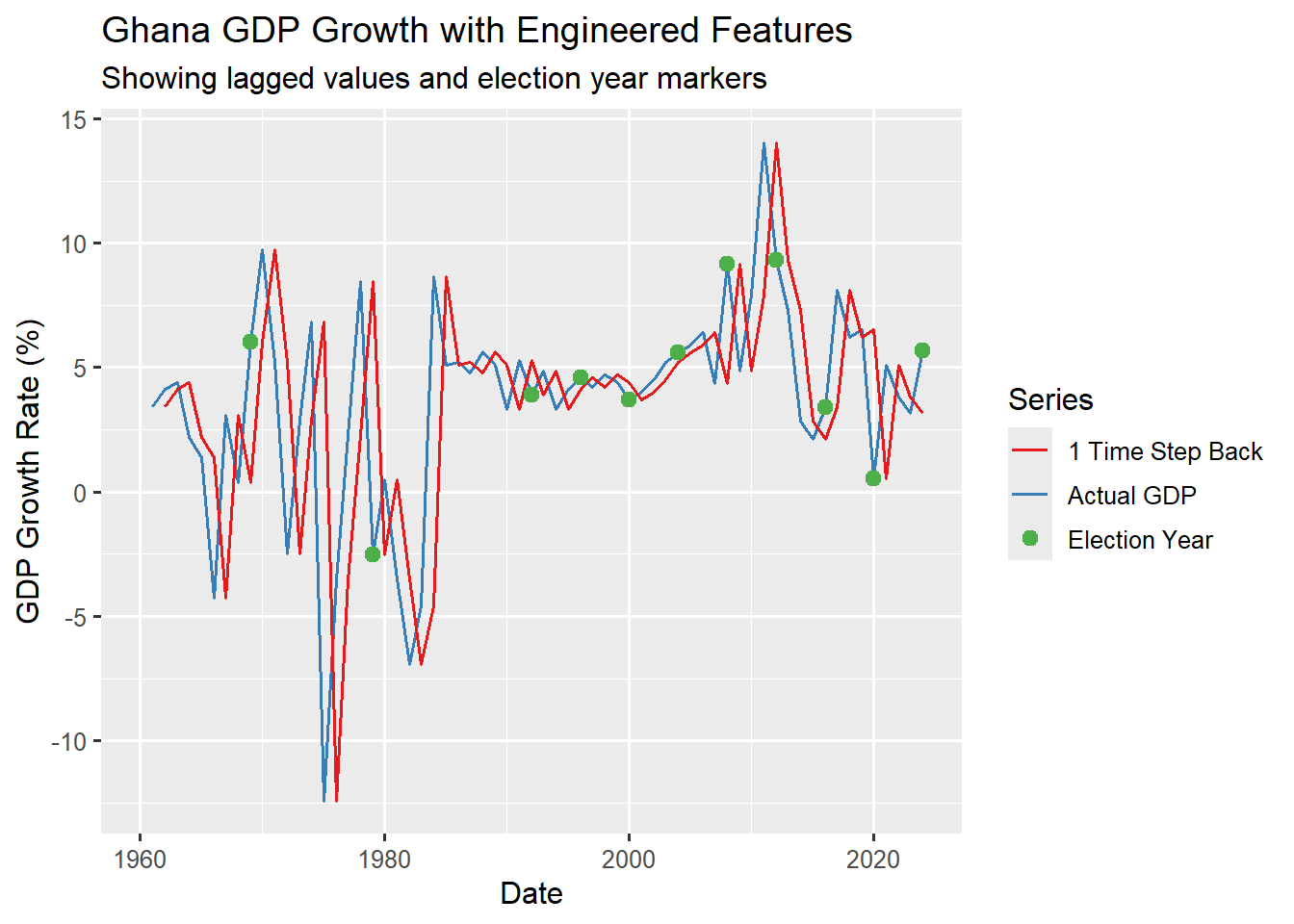
The above plot displays the actual GDP growth line and the lagged (1 time step back) GDP growth line visually confirming their relationship. There is also a large green dot over every data point that corresponds to an election_year. This allows you to check if GDP peaks or spikes tends to coincide with these politically charged years.
Your dates are now transformed into a rich set of features that can significantly improve your forecasting model(s). In the next section we will learn how to perform exploratory analysis on our time series data and delve deeper into visualisations to uncover trends and patterns before building our predictive models.
Note
The line plot in Figure 8.1 does not show how the plotted features are correlated it is just a visual representation of the selected features. A scatter plot is the best plot type to visualise their true correlation.
Tip
The feasts package makes performing some of these feature engineering very simple and straightforward. We will explore the feasts package in the next section.