9 Visualising Trends with ggplot2 and autoplot()
This is where we transform the raw data (tabular data) into compelling stories that reveal patterns, trends and insights hidden in your data. Since we now have control over date manipulations and feature engineering from the previous chapters, visualisation is the next crucial step.
A well crafted plot can instantly reveal what might take hours to discover through numerical analysis alone. In this chapter we will learn how to visualise our time series data using the flexible, customisable world of ggplot2 and the specialised, intelligent autoplot() function from the feasts package.
9.1 Basic Time Series Plots with ggplot2
9.1.1 Line Plots for Time Series
We will start with the most fundamental time series visualisation, the line plot. It is perfect for showing how values change over time
To demonstrate this we will use the gh_ts tsibble data and filter some few key indicators (Population_total, Life expectancy at birth, infant mortality_per_1000_births and Cereal yield _kg per hectare).
After filtering our data into a manageable subset (gh_key), we can now create individual line plots for each of the four indicators we filtered on. We will use the same basic ggplot2 syntax to produce these plots where we define aesthetics (aes()), specify the geometry (geom_line() for a line plot) and add labels (labs()).
# basic line plot for population total
pop_plot <- gh_key |>
  filter(indicator_name == "Population_total") |>
  ggplot(aes(x = date, y = value)) +
  geom_line(linewidth = 0.7) +
  labs(
    title = "Ghana Annual Total Population (1960-2024)",
    x = 'Year',
    y = "Total Population"   )
pop_plot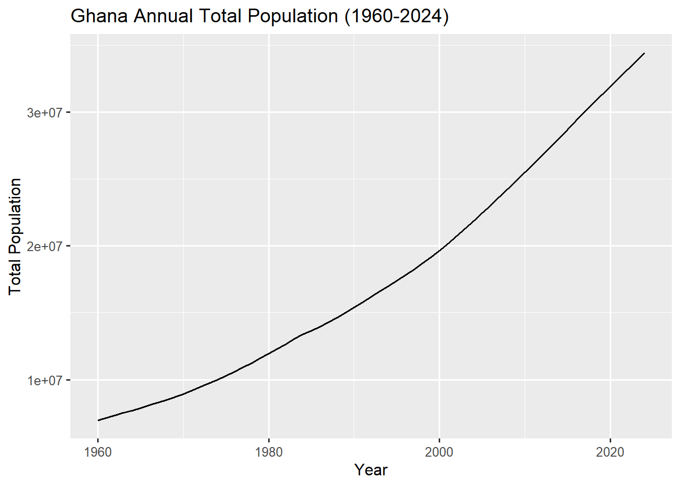
# basic line plot for life expectancy at birth
lifexp_plot <- gh_key |>
  filter(indicator_name == "Life expectancy at birth") |>
  ggplot(aes(x = date, y = value)) +
  geom_line(linewidth = 0.7) +
  labs(
    title = "Ghana Yearly Life Expectancy at Birth (1960-2024)",
    x = 'Year',
    y = "Life Expectancy at Birth"   )
lifexp_plot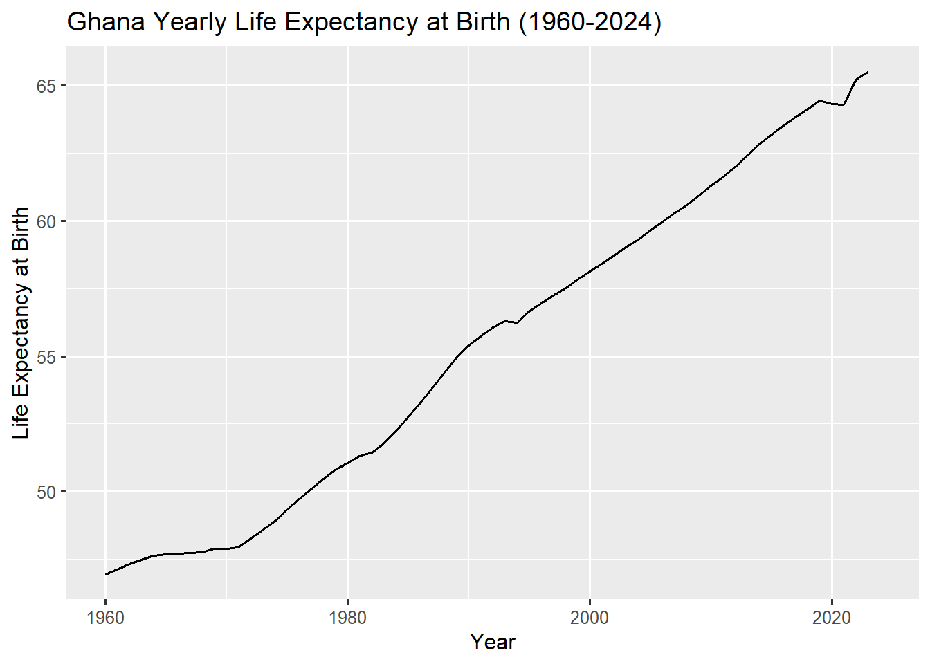
# basic line plot for infant mortality
Infmort_plot <- gh_key |>
  filter(indicator_name == "Infant mortality_per_1000_births") |>
  ggplot(aes(x = date, y = value)) +
  geom_line(linewidth = 0.7) +
  labs(
    title = "Ghana Annual Infant Mortality (1960-2024)",
    x = 'Year',
    y = "Infant Mortality/1000 births"   )
Infmort_plot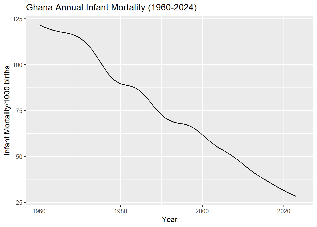
# basic line plot for cereal yield
cyield_plot <- gh_key |>
  filter(indicator_name == "Cereal yield _kg per hectare") |>
  ggplot(aes(x = date, y = value)) +
  geom_line(linewidth = 0.7) +
  labs(
    title = "Ghana Yearly Cereal Yield (1960-2024)",
    x = 'Year',
    y = "Cereal Yield/Hectare")
cyield_plot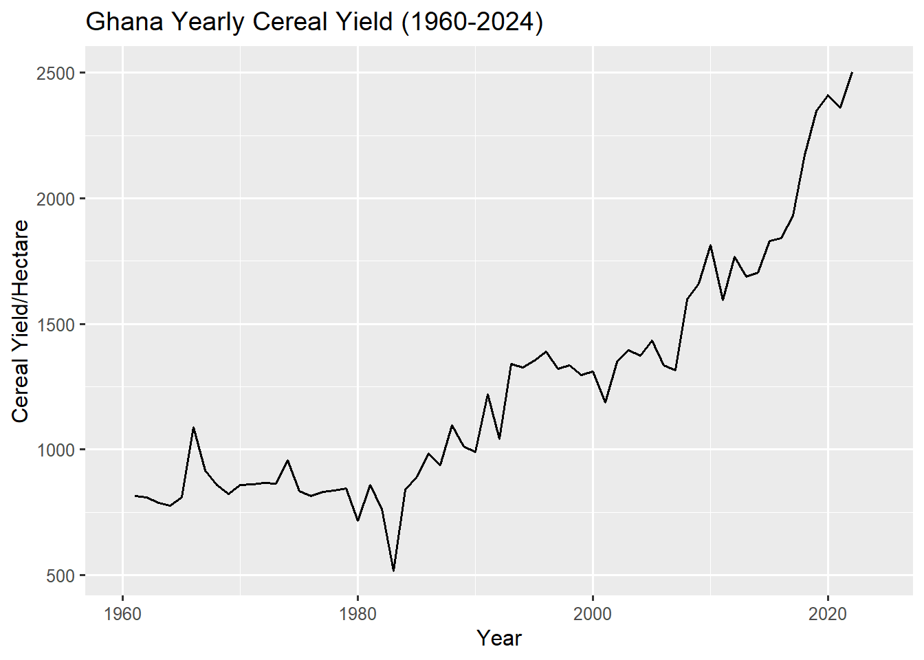
Each of the above code block generates a standard line plot for one of the selected indicators. this line of code ggplot(aes(x = date, y = value)) sets up the aesthetic mapping with time (date) on the x-axis and the values (value) on the y-axis. geom_line() creates the line connecting the data points and the linewidth = 0.7 sets the thickness of the line produced. The labs() function makes it possible to add informative titles and labels to the plots which you can specify as a string of texts (characters).
We can clearly see the dominant time series characteristic of these plots which is a strong trend. The annual total population plot shows a steep, continuous upward trend which signifies an accelerated population growth over the entire 64 year period. The life expectancy plot also shows a similar strong, persistent positive trend, illustrating how life expectancy has increased from around 45yrs between 1960 and 1970 to over 65yrs in 2024. This sharp increase can be attributed to improved medical care, public health and nutrition over the decades.
The plot for annual infant mortality has a continuous negative trend, indicating how infant mortality has fallen dramatically, dropping from over 120 per 1000 births in 1960 to under 30 in 2024. This reinforces the conclusion of improving health and sanitation from the life expectancy plot. The yearly cereal yield over the 64-year period also shows a generally positive long-term trend, but with significant fluctuations (spikes and dips) compared to the other plots. A pronounced upward acceleration is visible after the mid 1980s and especially after 2000. The sharp rise after 1980 likely reflects the intervention of the IMF (international monetary fund) and adoption of the Economic Recovery Program (ERP) in 1983 which significantly boosted the countries economy and reduced poverty levels.
9.1.2 Introducing autoplot()
Whiles ggplot gives you control, autoplot() from the feasts package provides intelligent defaults specifically designed for time series data. We can plot the same cereal yield time series in Figure 9.4 with the autoplt() function using the code below
# simple autoplot for cereal yield
cyield_autoplot <- gh_key |>
  filter(indicator_name == "Cereal yield _kg per hectare") |>
  autoplot(value, linewidth = 0.7) +
  labs(
    title = "Ghana Yearly Cereal Yield (1960-2024)",
    x = 'Year',
    y = "Cereal Yield/Hectare")
cyield_autoplot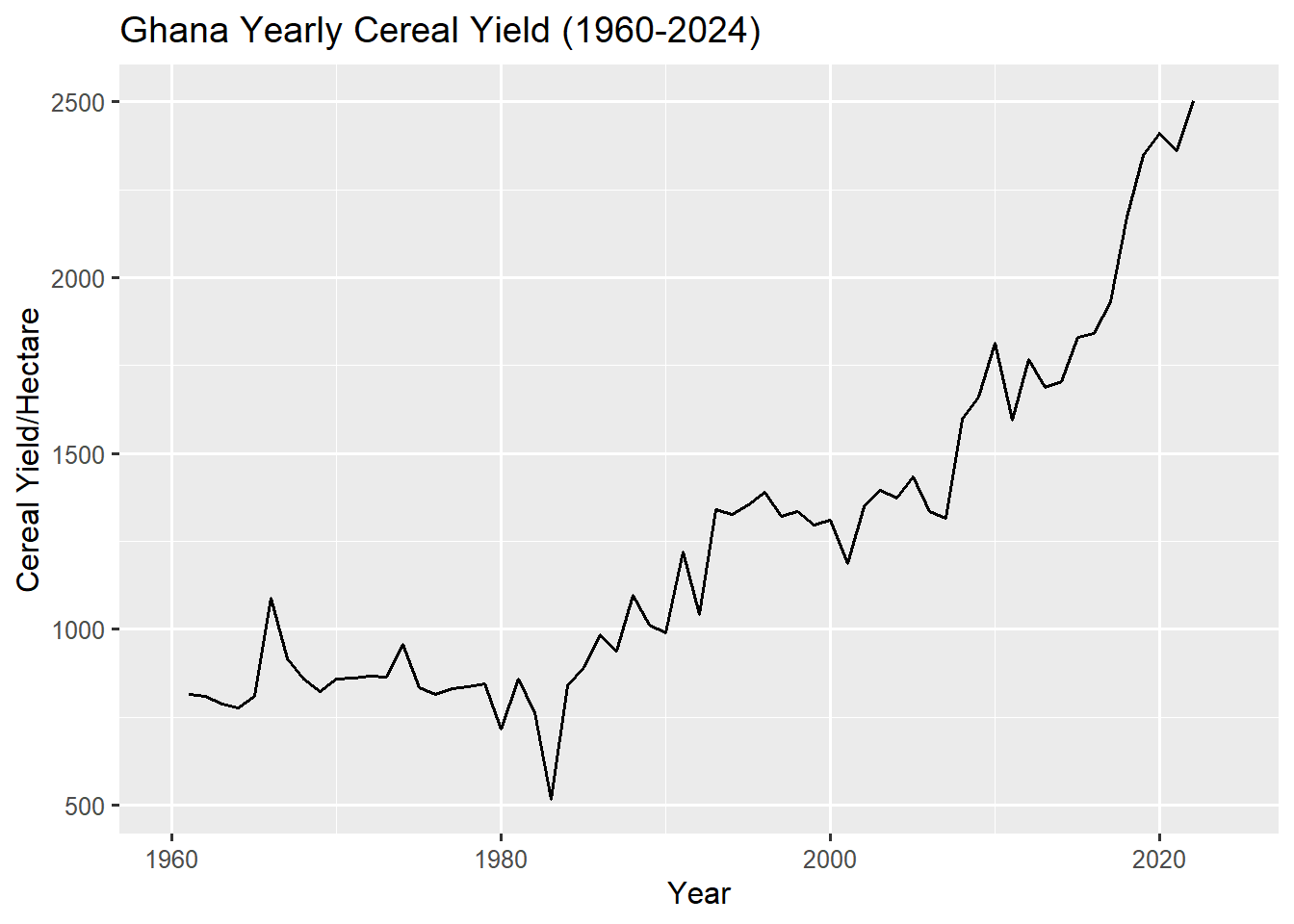
The autoplot() function is quick and saves time with aesthetic mappings and geometry specifications when using traditional ggplot2 layers. Although it actually is a specialised ggplot2 function, it automatically respects the index (time) and key (series) of the time series data (tsibble). It chooses appropriate geometry, formats date axes appropriately and applies sensible styling. All other ggplot2 graphical layers can be added to the autoplot() like we do in a traditional ggplot2 structure.
9.1.3 Enhancing Basic Plots
Let’s make our cyield_plot more informative by adding some additional features and improving the styling.
# basic line plot for cereal yield
enhanced_cyield_plot <- gh_key |>
  filter(indicator_name == "Cereal yield _kg per hectare") |>
  ggplot(aes(x = date, y = value)) +
  geom_line(linewidth = 0.7) +
  geom_point(aes(colour = value >= 1000), size = 1.5) +
  scale_colour_manual(
     na.translate = FALSE,
    values = c("TRUE" = 'darkgreen',"FALSE" = 'red',"NA" = NULL),
    labels = c("FALSE" = 'False', "TRUE" = 'True',"NA" = NULL),
    name = "High Yield"
  ) +
  geom_vline(xintercept = ymd("1983-04-20"),
             colour = 'navy',
             linetype = 'dashed',
             linewidth = 0.65) +
  labs(
    title = "Ghana Yearly Cereal Yield (1960-2024)",
    subtitle = "Vertical line indicates Year of Adopting ERP Policy",
    x = 'Year',
    y = "Cereal Yield per Hectare"
  )  +
  geom_smooth(method = 'loess', se=FALSE) +
  theme(
    plot.title = element_text(hjust = 0.5),
    plot.subtitle = element_text(hjust = 0.5)
  )
enhanced_cyield_plot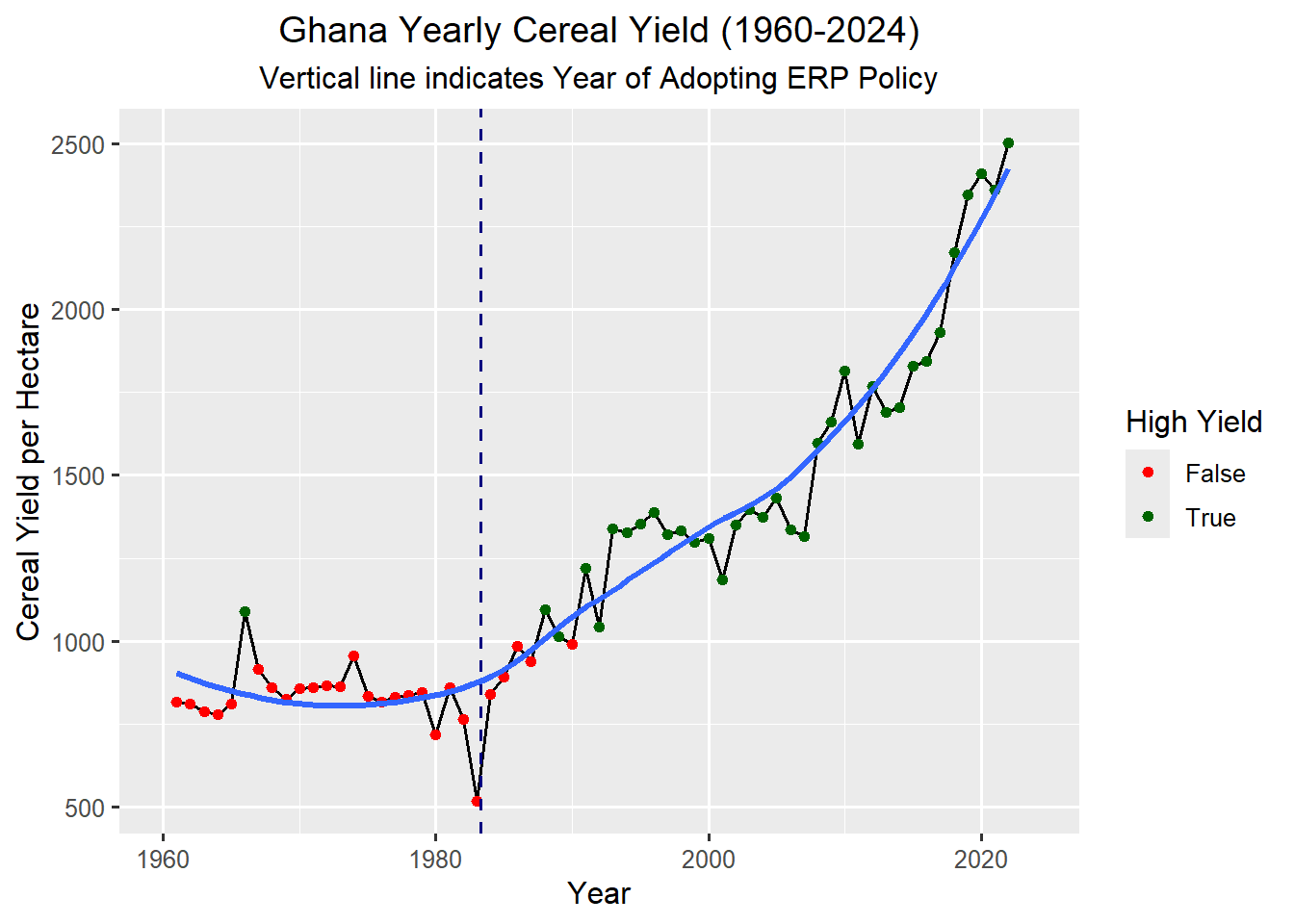
The plot above tells a detailed story about the Cereal Yield in Ghana from 1960 to 2024. Here we explicitly combine the time series data (gh_key ) with two very interesting engineered features – a threshold flag (red and green points) and a policy intervention marker (dashed vertical line) with a smoothed trend line (blue curved line) using the ggplot2 layered grammar of graphics syntax.
We start the whole process by filtering out the data to only include cereal yield _kg per hectare just like we did for Figure 9.4, we then initialise our plot, mapping the date and value columns to the x and y-axis respectively. geom_line(...) draws the the raw time series data. Inside the geom_point() function we create a threshold flag (High Yield) where we add points to the time series line and the colour is determined by the logical expression value >= 1000. If the yield is ≥ 1000, the colour is mapped to TRUE and if the yield is ˂ 1000, the colour is mapped to FALSE.
We use scale_colour_manual(...) to explicitly assign TRUE and FALSE logical values to specific colours and label names where TRUE (High Yield) is mapped to dark green and FALSE (Low Yield) is mapped to red. name = "High Yield" sets the title of the legend to “High Yield”. The yield value filtered from the data contains some missing data so our logical expression will automatically return NA’s together with the logical flag of TRUE and FALSE. By default the NA’s are labelled as part of the legend so we need to explicitly omit them with na.translate = FALSE and then map its colour to NULL.
The next feature that enhances the plots visual appeal is a vertical line that marks the point of policy change, a crucial contextual feature. geom_vline() helps us to achieve this feat. It draws a vertical line fixed at a particular point on the x-axis. This fixed x-intercept is set at the exact date of the intervention corresponding to the adoption of Ghana’s Economic Recovery Program (ERP) using xintercept = ymd("1983-04-20").
The final feature is a smoothed trend line which is drawn using the LOESS (Locally estimated Scatter-plot Smoothing) method with the help of geom_smooth(). This method is an excellent tool for creating flexible non-linear trend lines. se = FALSE suppresses the standard error band around the smooth line, keeping the plot clean. theme(...) is used to customise all aspects of the plot but for this visualisation, we only use it to centre the title and subtitle.
9.2 Multiple Time Series Plots for Comparison
9.2.1 Multiple Series with autoplot()
The autoplot() function truly shines when working with multiple time series data. However, it only works best when the series has the same value range since they are all plotted on a single graph.
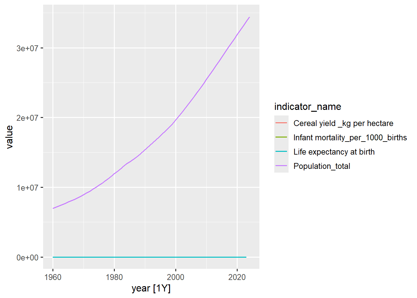
Notice how the plot in Figure 9.7 shows all the keys for all the series in the legend but the plot has only two lines representing population_total and life expectancy at birth. This happens because all the 4 series keys have varying range of values that would not fit perfectly in a single plot with a fixed scale. For example Population_total (in tens of millions) alongside life expectancy at birth (in hundreds) on the same y-axis renders the smaller series nearly flat and invisible.
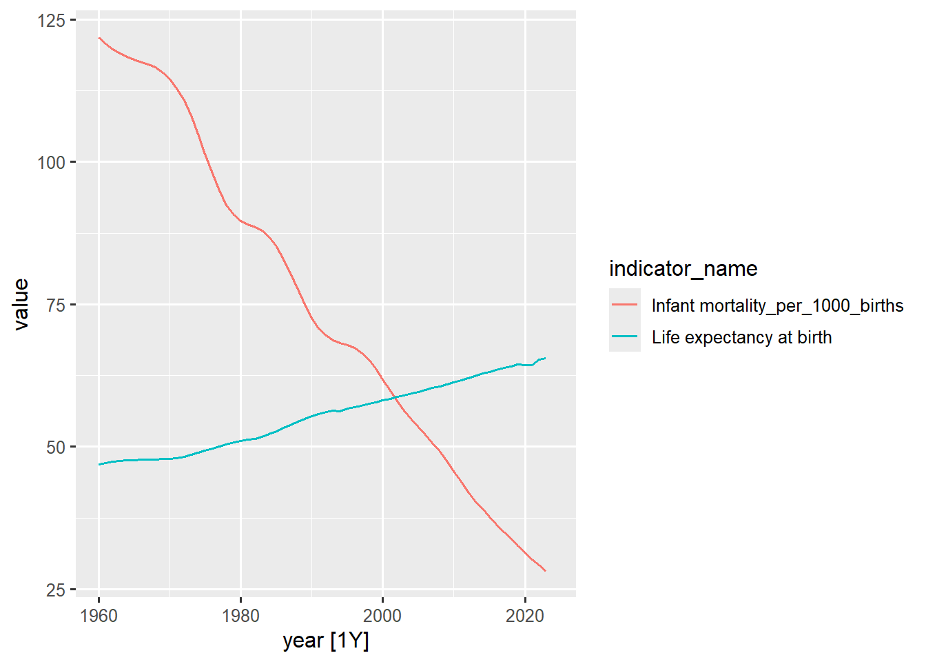
The plot in Figure 9.8 however is able to display all the two series keys in the legend because their value ranges fall within the y-axis scale of values although their appearance do not truly reflect their real characteristic if they were visualised individually as seen in Figure 9.3 and Figure 9.2.
9.2.2 Faceted Plots
To overcome the hurdle of inconsistent series value ranges on a single axis, we can facet our plots into separate panels using facet_wrap() from ggplot2 together with the autoplot() function. This allows each series to use its own optimised y-axis scale, enabling clear visual comparison of trends and patterns.
gh_key |>
  autoplot(value, linewidth = 0.7) +
  facet_wrap(vars(indicator_name), scales = 'free_y') +
  labs(
    title = "Multiple Indicators in Ghana",
    subtitle = "Faceted by Variable",
    x = 'Year'
  ) +
  # remove legend from plot
  theme(legend.position = 'none')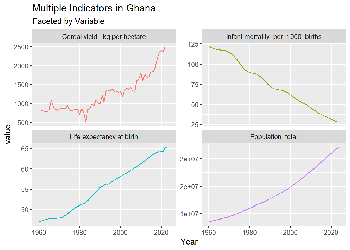
gh_key tsibble Dataset
The code output displays all four plots – each in its own panel. The core function in the above code is facet_wrap(vars(indicator_name),...). It tells ggplot2 to create a new, separate panel for every unique value found in the indicator_name column. The next critical aspect is scales = 'free_y', which instructs the facet_wrap() function to allow the y-axis to vary independently in each panel. Without this all panels would share the same scale, defeating the purpose of faceting the series. We finally remove the legend using theme(legend.position = 'none') since the series labels become redundant because they are given by the facet titles.
Faceted plots are the standard, most effective way to visualise multiple disparate time series data streams.
9.3 Visualising Monthly Data
So far we have only seen the series plot of yearly data from the gh_ts data set. While the yearly visuals is a good way of identifying long term trends it mostly lacks seasonality. On the other hand a monthly dataset has monthly frequency, which opens up possibilities for detecting cyclical seasonal patterns
9.3.1 Seasonal Patterns and Trends
To demonstrate seasonal patterns which is mostly common in monthly datasets (repeating every 12 months) we will use the sales_ts tsibble.
# Basic monthly time series plot
sales_ts |>
  autoplot(Sales, linewidth = 0.7) +
  labs(
    title = "Monthly Sales (2015-2019)",
    y = "Sales (₵)",
    x = "Date"
  )

sales_ts |>
  autoplot(Units_Sold, linewidth = 0.7) +
  labs(
    title = "Monthly Items Sold (2015-2019)",
    y = "Items",
    x = "Date"
  )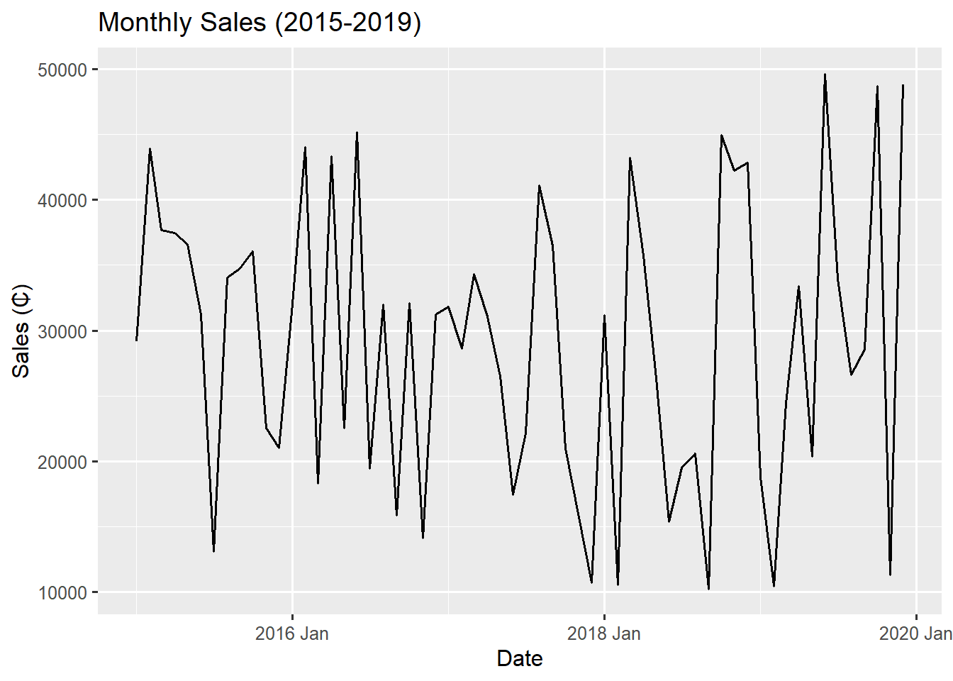
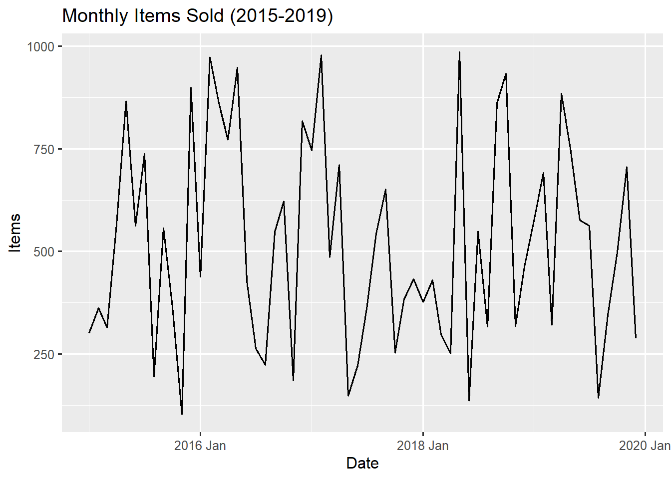
The two plots show some similar patterns, which is expected since sales is directly related to items sold.
The monthly sales series exhibits repeating seasonal peaks and troughs within each year and the pattern appears to involve some distinct high months (peaks) and low months (troughs) annually. This is the annual seasonality that most monthly datasets reveal. We can equally visualise the seasonal plot using the gg_season() function from the ggtime package. It overcomes the limitations of a simple line plot for monthly data by separating the data by year and laying the seasonal patterns on top of one another.
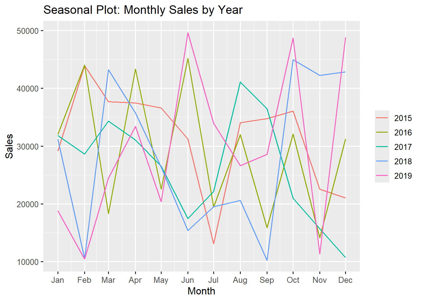
In terms of trend, there is no clear strong long term trend (upward or downward) across the 5-year period. for the monthly series plot in Figure 9.10 and Figure 9.11. The overall level of sales appears stationary fluctuating between GH₵10,000 and GH₵50,000. The seasonal plot however shows some declining trend in the 2016 season (olive green line) and a positive trend in the 2019 season (pink line).
The Sold items plot mirrors the Sales plot, showing the same seasonal pattern with minimal long-term trend. These plots confirm that any forecasting model for this data must account for the seasonal component.
In the next chapter we will delve into a more detailed visualisation of seasonal patterns and trends.
The gg_season() function is part of the feasts package but has been deprecated and moved to the new ggtime package which is basically designed for visualising time series patterns. It contains functions for exploring time series patterns like trends, seasonality, cycles and holidays.
9.4 Summary
So far you have mastered how to visualise your time series data using basic line plots with ggplot2 and autoplot(). You have seen how ggplot2 grants absolute control over every detail of your time series visualisations and how autoplot() delivers smart time series-specific defaults which drastically accelerates initial data exploration.
You can now make basic time series plots that reveal long term trends and seasonal cycles and also visualise multiple series simultaneously for comparative analysis.
In the next chapter, we are going to dive deeper into the feasts and fabletools package to explore advanced time series decomposition, autocorrelation analysis and statistical pattern detection. The visual foundation we have built here will help us interpret those more advanced analysis.
Remember that visualisation is both an art and a science. The best plots are those that not only look good but also communicate clear, accurate insights about your time series data. Practice creating different types of visualisations and always consider what story your data is trying to tell!